So today in this tutorial we’ll learn how to write HTML code for the Indian flag with CSS. Every HTML beginner needs to learn HTML by doing some exciting projects. So if you’re a beginner at HTML and want to do perfect handson, then this is the perfect project for you. So let us see how to write HTML code for the Indian flag.
Table of Contents
HTML Code For Indian Flag
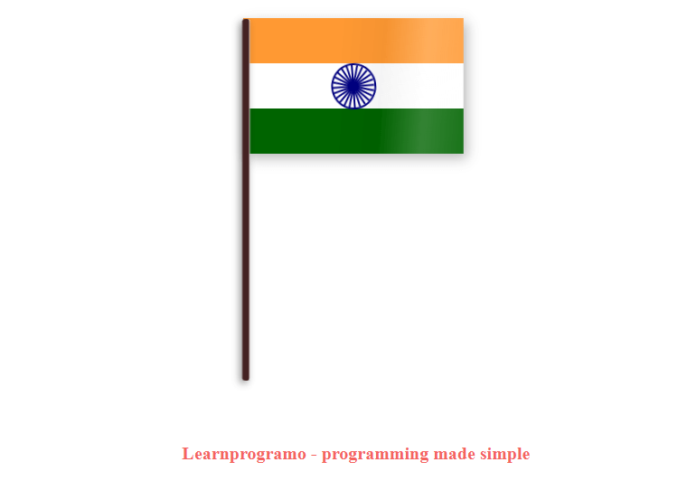
In this tutorial, we’ll design two types of Indian flags with the help of HTML and CSS. The first one will be the India flag with full CSS animation and the second one will be the Indian flag with rotating Ashoka chakra.
So first we’ll write the HTML code for the simple India Flag.
HTML code For Simple Indian Flag with Full CSS Animation
In this HTML code, the whole flag is animated. The Ashoka chakra is rotating the three colors are also animated and shiny. The shiny animation gives an extraordinary look to our Indian flag which looks beautiful. As Indians, we must keep our Indian flag animated and shiny.
The given below image is not animated because this is an only screenshot. But when you’ll add the code in VS Code and run the project, then the Indian flag will be animated.
You can download the full source code by clicking on the below download button. If you want quick code then copy the code which has been provided below the download button. First, you’ve to extract the downloaded zip file, then extract the folder on the desktop or any computer location. Then import that folder in VS Code and then run the HTML file using VS Code Live server extension. After running the code the Indian flag will be displayed on your browser.
Source Code:
The below code is HTML code. For that, you’ve to create an index.html file and then paste the below code into that file.
<!-- Learnprogramo - programming made simple -->
<!DOCTYPE html>
<head>
  <title>
    HTML Code For Indian Flag
  </title>
  <link href="/style.css" rel="stylesheet" />
</head>
<body>
  <div class="flag">
    <div class="saffron flag-item"></div>
    <div class="white flag-item">
      <div class="circle">
        <span class="bar"></span><span class="bar"></span><span class="bar"></span><span class="bar"></span><span
          class="bar"></span><span class="bar"></span><span class="bar"></span><span class="bar"></span><span
          class="bar"></span><span class="bar"></span><span class="bar"></span><span class="bar"></span>
      </div>
    </div>
    <div class="green flag-item"></div>
    <div class="flag-wave"></div>
  </div>
  <p class="info">
    <a href="https://learnprogramo.com/" target="_blank"> Learnprogramo - programming made simple</a>
  </p>
</body>
</html>
After creating the index.html file then you’ve to create one separate CSS file named style.css to design our HTML code.
/* Learnprogramo - programming made simple */
.flag {
    margin: 30px auto;
    position: relative;
    width: 250px;
    height: 150px;
    -webkit-perspective: 1000;
    -webkit-transform-style: preserve3d;
    -webkit-transform-origin: 0 250px;
    -webkit-transform: translate3d(0, 0, 0) rotateZ(0deg) rotateY(-22deg);
    -webkit-animation-name: wave;
    -webkit-animation-duration: 8s;
    -webkit-animation-timing-function: cubic-bezier(0.16, 0.14, 0.82, 0.73);
    -webkit-animation-timing-function: linear;
    -webkit-animation-iteration-count: infinite;
    perspective: 1000;
    transform-style: preserve3d;
    transform-origin: 0 250px;
    transform: translate3d(0, 0, 0) rotateZ(0deg) rotateY(-22deg);
    animation-name: wave;
    animation-duration: 8s;
    animation-timing-function: cubic-bezier(0.16, 0.14, 0.82, 0.73);
    animation-timing-function: linear;
    animation-iteration-count: infinite;
}

.flag:before {
    position: absolute;
    content: "";
    height: 400px;
    left: -1px;
    top: 1px;
    width: 8px;
    border-right: 1px solid #FFF;
    border-radius: 3px;
    background-color: #422;
    box-shadow: -3px 3px 8px 0px rgba(0, 0, 0, 0.4);
}

.white {
    background: #FFF;
}

.green {
    background: #006400;
}

.saffron {
    background: #F93;
}

.flag-item {
    height: 33.33%;
    box-sizing: border-box;
}

.flag-wave {
    position: absolute;
    top: 0;
    left: 0;
    width: 100%;
    height: 100%;
    background-image: -webkit-gradient(linear, 0 -25%, 100% top, color-stop(0%, rgba(255, 255, 255, 0)), color-stop(20%, rgba(255, 255, 255, 0)), color-stop(30%, rgba(0, 0, 0, 0.04)), color-stop(40%, rgba(255, 255, 255, 0.2)), color-stop(60%, rgba(255, 255, 255, 0)), color-stop(65%, rgba(255, 255, 255, 0.2)), color-stop(80%, rgba(0, 0, 0, 0.05)), color-stop(100%, rgba(255, 255, 255, 0)));
    background-size: 200%;
    -webkit-animation-name: air;
    -webkit-animation-duration: 8s;
    -webkit-animation-timing-function: cubic-bezier(0.16, 0.14, 0.82, 0.73);
    -webkit-animation-iteration-count: infinite;
}

.circle {
    width: 47px;
    height: 47px;
    border: 2px solid #000080;
    border-radius: 50%;
    position: absolute;
    left: 40%;
    -webkit-animation: circle 5s infinite;
    animation: circle 10s linear 2s infinite;
}

.circle:after {
    content: "";
    width: 3px;
    height: 3px;
    border-radius: 50%;
    background: #000080;
    position: absolute;
    top: 45%;
    left: 45%;
}

.bar {
    position: absolute;
    display: inline-block;
    height: 47px;
    width: 2px;
    background: #000080;
    left: 47%;
}

.bar:nth-child(1) {
    -ms-transform: rotate(15deg);
    -webkit-transform: rotate(15deg);
    transform: rotate(15deg);
}

.bar:nth-child(2) {
    -ms-transform: rotate(30deg);
    -webkit-transform: rotate(30deg);
    transform: rotate(30deg);
}

.bar:nth-child(3) {
    -ms-transform: rotate(45deg);
    -webkit-transform: rotate(45deg);
    transform: rotate(45deg);
}

.bar:nth-child(4) {
    -ms-transform: rotate(60deg);
    -webkit-transform: rotate(60deg);
    transform: rotate(60deg);
}

.bar:nth-child(5) {
    -ms-transform: rotate(75deg);
    -webkit-transform: rotate(75deg);
    transform: rotate(75deg);
}

.bar:nth-child(6) {
    -ms-transform: rotate(90deg);
    -webkit-transform: rotate(90deg);
    transform: rotate(90deg);
}

.bar:nth-child(7) {
    -ms-transform: rotate(105deg);
    -webkit-transform: rotate(105deg);
    transform: rotate(105deg);
}

.bar:nth-child(8) {
    -ms-transform: rotate(120deg);
    -webkit-transform: rotate(120deg);
    transform: rotate(120deg);
}

.bar:nth-child(9) {
    -ms-transform: rotate(135deg);
    -webkit-transform: rotate(135deg);
    transform: rotate(135deg);
}

.bar:nth-child(10) {
    -ms-transform: rotate(150deg);
    -webkit-transform: rotate(150deg);
    transform: rotate(150deg);
}

.bar:nth-child(11) {
    -ms-transform: rotate(165deg);
    -webkit-transform: rotate(165deg);
    transform: rotate(165deg);
}

@-webkit-keyframes circle {
    from {
        -ms-transform: rotate(0deg);
        -webkit-transform: rotate(0deg);
        transform: rotate(0deg);
    }

    to {
        -ms-transform: rotate(360deg);
        -webkit-transform: rotate(360deg);
        transform: rotate(360deg);
    }
}

@-webkit-keyframes wave {
    0% {
        box-shadow: 4px 5px 5px 0 rgba(0, 0, 0, 0.1);
        -webkit-transform: translate3d(0, 0, 0) rotateZ(0deg) rotateY(22deg);
    }

    20% {
        box-shadow: 4px 5px 15px 0 rgba(0, 0, 0, 0.1);
        -webkit-transform: translate3d(0, 0, 0) rotateZ(0deg) rotateY(0deg);
    }

    40% {
        box-shadow: 4px 5px 20px 0 rgba(0, 0, 0, 0.4);
        -webkit-transform: translate3d(0, 0, 0) rotateZ(0deg) rotateY(-22deg);
    }

    60% {
        box-shadow: 4px 5px 5px 0 rgba(0, 0, 0, 0.1);
        -webkit-transform: translate3d(0, 0, 0) rotateZ(0deg) rotateY(0deg);
    }

    80% {
        box-shadow: 4px 5px 5px 0 rgba(0, 0, 0, 0.3);
        -webkit-transform: translate3d(0, 0, 0) rotateZ(0deg) rotateY(16deg);
    }

    100% {
        box-shadow: 4px 5px 5px 0 rgba(0, 0, 0, 0.1);
        -webkit-transform: translate3d(0, 0, 0) rotateZ(0deg) rotateY(22deg);
    }
}

@-webkit-keyframes air {
    0% {
        background-position: -200% 0px;
    }

    30% {
        background-position: -60% 5px;
    }

    70% {
        background-position: 70% -5px;
    }

    100% {
        background-position: 200% 0px;
    }
}

.info {
    text-align: center;
    margin-top: 320px;
}

.info a {
    text-decoration: none;
    font-size: 20px;
    color: #f4645f;
    font-weight: 700;
}
HTML Code For Indian Flag With Rotating Ashoka Chakra
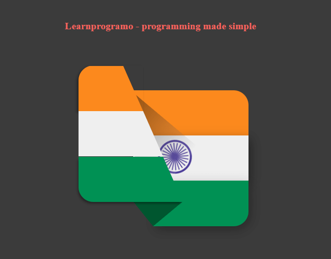
Now we’ll write HTML code for the second type of Indian Flag. In this HTML code, only the Ashoka Chakra will be rotating. The flag will remain constant. The flag is tilted at the bottom as shown in the below image.
You can download the full source code by clicking on the below download button. If you want quick code then copy the code which has been provided below the download button. First, you’ve to extract the downloaded zip file, then extract the folder on the desktop or any computer location. Then import that folder in VS Code and then run the HTML file using VS Code Live server extension. After running the code the Indian flag will be displayed on your browser.
Source Code:
The below code is HTML code. For that, you’ve to create an index.html file and then paste the below code into that file.
<!-- Learnprogramo - programming made simple -->
<!DOCTYPE html>
<head>
  <title>
    HTML Code For Indian Flag
  </title>
  <link href="/style.css" rel="stylesheet" />
</head>
<body>
  <div class="main-container">
    <div class="pr">
      <div class="flag1">
        <div class="pr">
          <div class="color1"></div>
          <div class="color2"></div>
          <div class="color3"></div>
        </div>
      </div>
      <div class="flag2">
        <div class="pr">
          <div class="color1"></div>
          <div class="color2"></div>
          <div class="color3"></div>
          <div class="circle">
            <div class="inner-circle"></div>
            <div class="line line1"></div>
            <div class="line line2"></div>
            <div class="line line3"></div>
            <div class="line line4"></div>
            <div class="line line5"></div>
            <div class="line line6"></div>
            <div class="line line7"></div>
            <div class="line line8"></div>
            <div class="line line9"></div>
            <div class="line line10"></div>
            <div class="line line11"></div>
            <div class="line line12"></div>
          </div>
        </div>
      </div>
    </div>
  </div>
  <p class="info">
    <a href="https://learnprogramo.com/" target="_blank"> Learnprogramo - programming made simple</a>
  </p>
</body>
</html>
After creating the index.html file then you’ve to create one separate CSS file named style.css to design our HTML code.
/* Learnprogramo - programming made simple */
body {
    padding: 0;
    margin: 0%;
    background: #3b3b3b;
    min-height: 100%;
    min-width: 100%;
}

.main-container {
    margin: auto;
    top: 0;
    bottom: 0;
    left: 0;
    right: 0;
    height: 400px;
    width: 400px;
    position: absolute;
}

.pr {
    position: relative;
}

.main-container>.pr {
    height: 400px;
    height: 400px;
}

.flag1 {
    height: 275px;
    width: 210px;
    position: absolute;
    top: 25px;
    left: 35px;
    border-radius: 30px 0 0 30px;
    z-index: 2;
}

.flag1 .color1 {
    border-bottom: 91.66px solid #fc891d;
    border-right: 40px solid transparent;
    width: 90px;
    border-top-left-radius: 30px;
    box-shadow: -3px 3px 5px rgba(0, 0, 0, 0.4);
}

.flag1 .color2 {
    border-bottom: 91.66px solid #efefef;
    border-right: 40px solid transparent;
    width: 130px;
}

.flag1 .color3 {
    border-bottom: 91.66px solid #009154;
    border-right: 40px solid transparent;
    width: 170px;
    border-bottom-left-radius: 30px;
    box-shadow: -3px 5px 5px -2px rgba(0, 0, 0, 0.4);
}

.flag2 {
    height: 275px;
    width: 232px;
    position: absolute;
    top: 75px;
    left: 145px;
    border-radius: 0 30px 30px 0;
    z-index: 1;
}

.flag2:after {
    content: "";
    position: absolute;
    height: 97px;
    width: 200px;
    background: linear-gradient(to right, rgba(0, 0, 0, 0.5), rgba(255, 255, 255, 0.1));
    top: 38px;
    left: -78px;
    transform: rotate(40deg);
}

.flag2 .color1 {
    border-bottom: 91px solid #fc891d;
    width: 100%;
    border-top-right-radius: 30px;
}

.flag2 .color2 {
    border-bottom: 91px solid #efefef;
    box-shadow: 5px 7px 21px rgba(0, 0, 0, 0.4);
    width: 100%;
}

.flag2 .color3 {
    border-bottom: 92px solid #009154;
    width: 192px;
    margin-left: 40px;
    border-bottom-right-radius: 30px;
    box-shadow: 5px 7px 21px rgba(0, 0, 0, 0.3);
}

.flag2 .color3:before {
    content: "";
    position: absolute;
    border-top: 50px solid #00562f;
    height: 50px;
    width: 0;
    bottom: -50px;
    left: 0;
    border-left: 40px solid transparent;
}

.flag2 .color3:after {
    content: "";
    position: absolute;
    border-top: 50px solid #00562f;
    height: 50px;
    width: 0;
    bottom: -50px;
    left: 40px;
    border-right: 60px solid transparent;
}

.flag2 .circle {
    height: 60px;
    width: 60px;
    position: absolute;
    border: 4px solid #4c3d99;
    border-radius: 50%;
    top: 100px;
    left: 50px;
}

.flag2 .inner-circle {
    background-color: #4c3d99;
    height: 10px;
    width: 10px;
    border-radius: 50%;
    margin-left: auto;
    margin-right: auto;
    margin-top: 25px;
}

.circle .line {
    background-color: #4c3d99;
    width: 2px;
    height: 55px;
    border-radius: 2px;
    position: absolute;
    top: 2px;
    left: 29px;
}

.circle .line1 {
    transform: rotate(15deg);
}

.circle .line2 {
    transform: rotate(30deg);
}

.circle .line3 {
    transform: rotate(45deg);
}

.circle .line4 {
    transform: rotate(60deg);
}

.circle .line5 {
    transform: rotate(75deg);
}

.circle .line6 {
    transform: rotate(90deg);
}

.circle .line7 {
    transform: rotate(105deg);
}

.circle .line8 {
    transform: rotate(120deg);
}

.circle .line9 {
    transform: rotate(135deg);
}

.circle .line10 {
    transform: rotate(150deg);
}

.circle .line11 {
    transform: rotate(165deg);
}

.circle .line12 {
    transform: rotate(180deg);
}

.circle {
    animation: rotate 10s linear infinite;
}

.info {
    text-align: center;
    margin-top: 200px;
}

.info a {
    text-decoration: none;
    font-size: 20px;
    color: #f4645f;
    font-weight: 700;
}

@keyframes rotate {
    0% {
        transform: rotate(0deg);
    }

    100% {
        transform: rotate(360deg);
    }
}
Steps for Creating HTML Code for Indian Flag
We’ll teach you how you can create an HTML project using easy and simple 5 steps:
1st Step: Choose an HTML Editor
Like you need a Microsoft word to edit a text file, similarly, an HTML Code Editor is needed to edit the HTML file. There are dozens of code editors present in the market but, I’ll prefer you to choose VS Code which is also called Visual Code and is created by Microsoft. You can also download VS Code from this link.
Why I’m recommending you to use VS Code because you can format the document using one click and VS Code also comes with a Live Server Extension. This extension is used to compile and run the HTML file which we coded in VS Code.
The VS Code also has some extraordinary functionalities like auto-completion of the code and the search-replace functionality. It also consists of some shortcut keys which copy the current line down so you don’t have to copy and paste the whole line.
2nd Step: Create your HTML File
After doing the setup of the code editor then the next step is to create one file with the extension .html. You have to tell the code editor that this is the file that I want to compile and run. For that, you’ve to create one folder on your PC, and then you’ve to import that folder into VS Code which is also called a working directory.
3rd Step: Start Writing the HTML Code
After importing the main HTML file in VS Code then start writing the HTML Code i.e Indian Flag Using HTML and CSS First, write the HTML starter boilerplate, then add the link to the CSS file, then start writing the HTML code in the body tag.
Generally, the HTML form is made up of different HTML elements such as input fields, radio buttons, checkboxes, buttons such as submit and reset, etc. Every tag in HTML has its own functionality such as input types are used to accept the input from the user, radio buttons are used to select any one option from the two i.e gender male or female, etc.
Every HTML tag should always have its own closing tag. For example: if you write a tag such as <body> then there should always closing tag for body i.e </body>. HTML also consists of tags which can be closed by self also called as self-closing tags i.e <img/>, <br/> etc.
4th Step: Add Some Placeholders
The HTML input tags come with the functionalities called placeholders which are the text prompted inside the input fields. The placeholders tell users in which format they’ve to insert their text so that there will be no misinformation entered by the user.
In this form, we’ve added placeholders to each and every input tag i.e First name, Last Name, Email, Phone number, etc. You can also add your custom placeholder by changing the data entered inside the placeholder function tag.
5th Step: Compile the Code
Now After editing and writing the code you’ve to test your code to check whether the code you’ve written is working fine or not. For that, you’ve to add one extension in VS Code called “Live Server”. After installing these extensions Live Server option will come at the right bottom side of your VS Code. After clicking on that button your HTML File will start running on the port defined by the Live Server.
Now check whether the HTML File is working correctly or not.
Conclusion
In this way, we’ve learned how to write HTML code for Indian flag using CSS. If you have any doubts then please feel free to contact us. We’ll resolve your doubts as soon as possible.
Thanks and Happy Coding 🙂
Also Read:
- Student Registration Form Using HTML and CSS.
- How to Generate PDF using HTML Form in PHP using Mpdf.
- HTML code for Facebook Login.